股市人生
操作及随感The NYMO and NAMO indicators are also called the McClellan Oscillator, the NYMO is derived from the NYSE while the NAMO is derived from the Nasdaq. Below I show a few chart examples of this 'Quasi Mechanical System', but first let's cover the definition of what the NYMO and NAMO are.
Definition
Developed by Sherman and Marian McClellan, the McClellan Oscillator is a breadth indicator derived from Net Advances, the number of advancing issues less the number of declining issues. Subtracting the 39-day exponential moving average of Net Advances from the 19-day exponential moving average of Net Advances forms the oscillator. As the formula reveals, the McClellan Oscillator is a momentum indicator that works similar to MACD. McClellan Oscillator signals can be generated with breadth thrusts, centerline crossovers, overall levels and divergences.
Ratio Adjusted
The McClellan Oscillator at Stockcharts.com is ratio adjusted to take into account changing totals in issues traded on the NYSE and Nasdaq. Instead of using Net Advances, Stockcharts.com calculates Net Advances as a percentage of advances plus declines. The result is then multiplied by 1000 to obtain whole numbers and eliminate decimals. This ratio adjustment makes it possible to compare McClellan Oscillator levels over a period of time. The NYSE traded just over 2000 stocks in 1990 and 1991. The total surged throughout the 90s and exceeded 3000 in 1995. Between 1998 and 2010, the NYSE traded between 3000 and 3600 stocks on a daily basis. Because of this increase, it would not be possible to compare the early 90's McClellan Oscillator with the late 90's McClellan Oscillator. Raw numbers for advances and declines do not reflect the fluid nature of total issues. Ratio adjusted net advances (RANA) solves this problem by showing net advances as a percentage of advances plus declines.
Use as a quasi Bollinger Band System for identifying tradeable market bottoms and tops
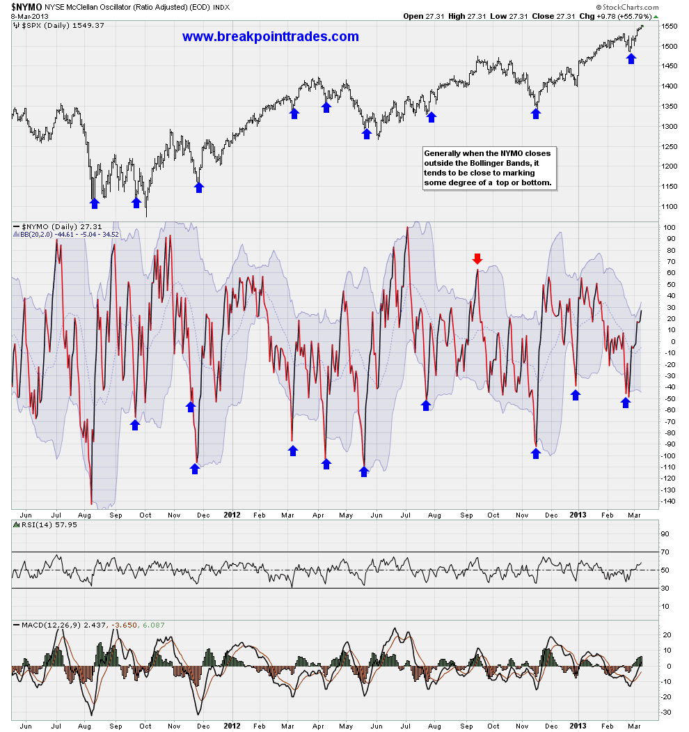
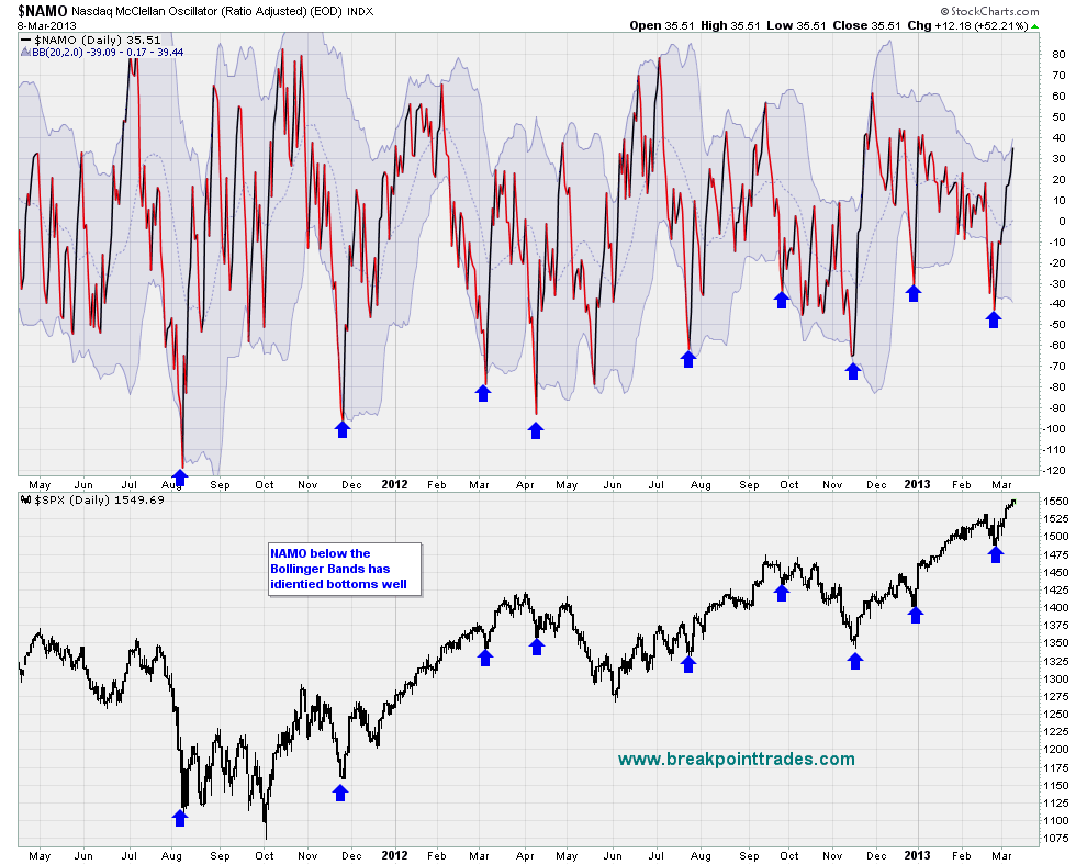
Below are chart examples of the NYMO and NAMO plotted with simply with Bollinger Bands, and as you can see from the charts notice that when then these indicators close below or above their respective Bollinger Bands, they are pretty good at marking tradeable market bottoms and tops (however they appear to be better at markting bottoms vs tops. The reason I label these charts as a 'Qasi System' is because I have not done the statistics or went throught the trades with a fine tooth comb in order to come up with a set of hard rules. Simple use these charts indicators as a visual tool to hel indentify market inflection points i.e. tradeable bottoms or tops.
Below is a chart of the NYMO plotted with Bollinger Bands - notice how well it has identified tradeable market bottoms
Please note, the images below are static and I will not be updating them that often, if you want to see a live chart, click the URL above)

And below is a chart of the NAMO with Bollinger Bands (the Nasdaq McClellan Oscillator) -notice how well it has identified tradeable market bottoms (click here for a real time chart).
Please note, the images below are static and I will not be updating them that often, if you want to see a live chart, click the URL above)


